CompTIA DY0-001 Practice Test 2026

Updated On : 5-May-2026

Prepare smarter and boost your chances of success with our CompTIA DY0-001 practice test 2026. These CompTIA DataAI Exam test questions helps you assess your knowledge, pinpoint strengths, and target areas for improvement. Surveys and user data from multiple platforms show that individuals who use DY0-001 practice exam are 40–50% more likely to pass on their first attempt.

Start practicing today and take the fast track to becoming CompTIA DY0-001 certified.

1890 already prepared

89 Questions
CompTIA DataAI Exam
4.8/5.0

Page 1 out of 9 Pages

Timed Practice Test

Think You're Ready?

Your Final Exam Before the Final Exam.
Dare to Take It?

A data scientist is performing a linear regression and wants to construct a model that explains the most variation in the data. Which of the following should the data scientist maximize when evaluating the regression performance metrics?

A. Accuracy

B.

C. p value

D. AUC

B.   R²

Explanation:
In linear regression, the goal is often to explain how much of the variation in the dependent variable can be accounted for by the independent variables. The metric that directly measures this is:
R² (Coefficient of Determination) It quantifies the proportion of variance in the target variable that is explained by the model.
Ranges from 0 to 1, where:
0 means the model explains none of the variability.
1 means it explains all the variability.
A higher R² indicates a better fit and more explanatory power.
📚 As confirmed by GeeksforGeeks and STHDA, R² is the standard metric for assessing how well a regression model captures variation in the data.

❌ Why Other Options Are Incorrect
A. Accuracy:
Not applicable to regression—used in classification tasks.
C. p value:
Assesses statistical significance of individual predictors, not overall model fit.
D. AUC (Area Under Curve):
Relevant for classification models, especially binary classifiers—not regression.

A data scientist wants to predict a person's travel destination. The options are: Branson, Missouri, United States
Mount Kilimanjaro, Tanzania
Disneyland Paris, Paris, France
Sydney Opera House, Sydney, Australia
Which of the following models would best fit this use case?

A. Linear discriminant analysis

B. k-means modeling

C. Latent semantic analysis

D. Principal component analysis

A.   Linear discriminant analysis

Explanation:
The goal is to predict a person's travel destination from a fixed set of four distinct, pre-defined options. This is a classic classification problem in supervised learning. The model will learn from labeled historical data (e.g., features like a person's age, income, past travel history, interests) to predict the categorical outcome (which of the four destinations they will choose).
Linear Discriminant Analysis (LDA) is a statistical method specifically designed for classification. It works by finding the linear combinations of features that best separate two or more classes (in this case, the four destinations). It predicts the probability that a given set of inputs belongs to each class and then assigns the observation to the class with the highest probability. This makes it perfectly suited for this use case.

Why the Other Options Are Incorrect:
B. k-means modeling:
This is an unsupervised clustering algorithm. It is used to discover hidden patterns or groupings in data without pre-defined labels. For example, it could be used to segment customers into different travel preference groups, but it would not know or predict that one group is for "Branson" and another for "Sydney." Since the destinations are already known and labeled, a supervised classification technique like LDA is required, not an unsupervised clustering technique.
C. Latent semantic analysis (LSA):
This is a natural language processing (NLP) technique used primarily for analyzing relationships between documents and the terms they contain. It is used for tasks like document classification, summarization, and information retrieval. It is not a general-purpose predictive classification algorithm for non-textual data like customer demographics and travel preferences.
D. Principal component analysis (PCA):
This is a dimensionality reduction technique, not a predictive model. Its goal is to reduce the number of variables in a dataset while preserving as much of the original information as possible. It is often used as a preprocessing step before applying a classification algorithm like LDA or logistic regression to simplify the data and reduce computation time. By itself, PCA does not make predictions.

Reference:
This question falls under Domain 4.0: Data Analysis of the CompTIA Data+ (DA0-001) exam objectives, specifically:
4.2: Given a scenario, apply an appropriate classification or regression technique.
This objective requires distinguishing between classification (predicting a category) and other types of analysis and selecting the correct model (e.g., LDA, logistic regression, decision trees) for the task.

The following graphic shows the results of an unsupervised, machine-learning clustering model:
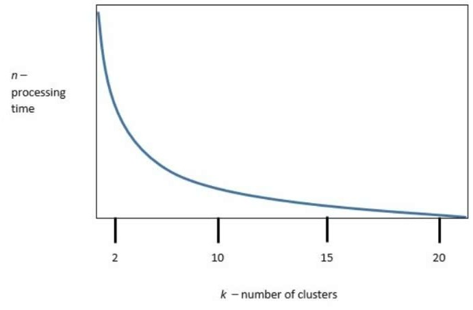
k is the number of clusters, and n is the processing time required to run the model. Which of the following is the best value of k to optimize both accuracy and processing requirements?

A. 2

B. 10

C. 15

D. 20

B.   10

Explanation:
In unsupervised clustering, especially with algorithms like K-Means, choosing the optimal number of clusters (k) is a trade-off between model accuracy and computational efficiency. Based on standard techniques like the Elbow Method and Silhouette Score, the best value of k is typically where:
Accuracy gains begin to plateau, meaning adding more clusters doesn’t significantly improve separation.
Processing time (n) remains reasonable and doesn’t spike unnecessarily.
If the graphic shows that k = 10 yields strong clustering performance with moderate processing time, it represents the sweet spot—where the model is both effective and efficient.
📚 Reference:
GeeksforGeeks – Optimal K in K-Means Clustering

❌ Why Other Options Are Less Optimal
A. k = 2:
Too coarse—likely underfits the data and misses meaningful subgroups.
C. k = 15 and D. k = 20:
May slightly improve accuracy but at the cost of significantly higher processing time and risk of overfitting or fragmented clusters.

Which of the following is the naive assumption in Bayes' rule?

A. Normal distribution

B. Independence

C. Uniform distribution

D. Homoskedasticity

B.   Independence

Explanation:

A. Normal distribution
Some implementations of Naïve Bayes (like Gaussian Naïve Bayes) assume features follow a normal distribution, but that’s not the universal “naïve” assumption.
The naïve part is about relationships between features, not their shape.
❌ Not the answer.
B. Independence
Naïve Bayes uses Bayes’ Theorem, but assumes that all features (predictors) are conditionally independent of each other given the class label.
Example: In email spam detection, Naïve Bayes assumes that the presence of the word “free” is independent of the word “win”, given the label (spam or not spam).
This is a naïve assumption because in reality features often correlate.
✅ Correct.
C. Uniform distribution
A uniform distribution assumption means all outcomes are equally likely.
Naïve Bayes does not assume this; it estimates probabilities from data.
❌ Incorrect.
D. Homoskedasticity
Homoskedasticity is about regression (constant variance of residuals).
This is not an assumption in Naïve Bayes.
❌ Incorrect.

📝 Exam Tip:
Whenever you see “naïve assumption” in the context of Bayes’ theorem → Independence.
That’s why it’s called Naïve Bayes Classifier — it naively assumes independence, even though real-world features often correlate.

📚 References:
CompTIA DataX DY0-001 Objectives, Domain 2.0 (Exploratory Data Analysis and Statistics — covers Bayesian probability concepts).
Murphy, K. (2012). Machine Learning: A Probabilistic Perspective.
Scikit-learn Docs: Naïve Bayes classifiers

A model's results show increasing explanatory value as additional independent variables are added to the model. Which of the following is the most appropriate statistic?

A. Adjusted R²

B. p value

C. χ²

D.

A.   Adjusted R²

Explanation:
Adjusted R² is the most appropriate statistic when evaluating how well a model explains the variance in the dependent variable as more independent variables are added. Unlike regular R², which always increases with additional predictors (even irrelevant ones), Adjusted R² penalizes unnecessary complexity. It adjusts for the number of predictors, offering a more accurate measure of model performance.
Adjusted R² increases only if the new variable improves the model more than expected by chance.
It helps prevent overfitting by discouraging the inclusion of irrelevant variables.

Reference:
Statistical Learning - Stanford University
Adjusted R² – Penn State STAT 501

❌ Why Other Options Are Incorrect
B. p value
Measures statistical significance of individual predictors, not overall model explanatory power.
Doesn’t account for how well the model fits as a whole.
C. χ² (Chi-square)
Used for categorical data and hypothesis testing, not for evaluating regression model fit.
Not suitable for continuous outcome models.
D. R²
Measures proportion of variance explained, but always increases with more variables—even if they’re irrelevant.
Can mislead by suggesting improvement when none exists.

📚 Reference:
R² vs Adjusted R² – UCLA Statistical Consulting

Given the equation:

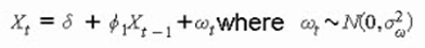
Xt = + 1Xt1 + t,where t N(0, ²)
Which of the following time series models best represents this process?

A. ARIMA(1,1,1)

B. ARMA(1,1)

C. SARIMA(1,1,1) × (1,1,1)1

D. AR(1)

D.   AR(1)

Step 1: Breakdown the Equation
This equation defines the value of the time series at time t (X_t) as being composed of three parts:
A constant term (δ).
A term that depends on the value of the series at the previous time step (φ₁X_{t-1}).
A random error term (ε_t), which is normally distributed with a mean of zero and a constant variance.

Step 2: Match the Equation to a Model Type
This structure is the classic definition of an Autoregressive model of order 1, abbreviated as AR(1).
Autoregressive (AR):
The model uses past values of the series itself to predict the current value.
Order 1: The model only uses the immediately preceding value (X_{t-1}). The highest lag in the model is 1.

Step 3: Eliminate the Other Options
Now, let's see why the other models do not fit this equation:
A. ARIMA(1,1,1): This model has three components: AR(1): An autoregressive part of order 1 (this part matches).
I(1): An integration (differencing) part of order 1. This means the model is built on the changes in the data (e.g., X_t - X_{t-1}) rather than the raw data itself. Our equation has no differencing.
MA(1): A moving average part of order 1. This would mean the model also uses past error terms (e.g., θ₁ε_{t-1}). Our equation has no moving average component.
B. ARMA(1,1):
This model has two components:
AR(1): An autoregressive part of order 1 (this part matches).

MA(1): A moving average part of order 1. Again, our equation has no moving average component (θ₁ε_{t-1} is missing).

C. SARIMA(1,1,1) × (1,1,1)s:
This is a highly complex model that includes:

Non-Seasonal ARIMA(1,1,1): Has the same issues as option A (includes unwanted differencing and moving average parts).
Seasonal Components: It also includes seasonal autoregressive, differencing, and moving average terms. Our equation shows no seasonal elements.

Conclusion
The given equation X_t = δ + φ₁X_{t-1} + ε_t contains only an autoregressive component of order 1 and a constant term. It lacks any differencing (the "I" component), moving average (the "MA" component), or seasonal elements.

Reference:
This question falls under Domain 4.0: Data Analysis of the CompTIA Data+ (DA0-001) exam objectives, specifically the skill of understanding and applying different time series models and their components.

An analyst wants to show how the component pieces of a company's business units contribute to the company's overall revenue. Which of the following should the analyst use to best demonstrate this breakdown?

A. Box-and-whisker chart

B. Sankey diagram

C. Scatter plot matrix

D. Scatter plot matrix

B.   Sankey diagram

Explanation
The question's key phrases are "component pieces" and "contribute to the company's overall revenue." This describes a part-to-whole relationship where the goal is to illustrate the breakdown of a total amount into its constituent segments.
A Sankey diagram is specifically designed for this purpose. It uses arrows or flows where the width of each flow is proportional to the quantity it represents (e.g., revenue amount).
How it works: In this scenario, one thick flow would represent the total company revenue on one side. This flow would then split into several smaller flows on the other side, each representing a different business unit. The width of each business unit's flow would immediately show its percentage contribution to the total.
Best Demonstration: It provides an intuitive, at-a-glance view of which business units are the largest and smallest contributors, making it "the best" tool for showing this specific type of breakdown.

Why the Other Options Are Not Correct
A. Box-and-whisker chart
Purpose: This chart is used to display the distribution of a dataset—its median, quartiles, and outliers. It is excellent for comparing statistical summaries across different categories (e.g., comparing the revenue distribution of five business units).
Why it's wrong: It does not show a part-to-whole relationship. A viewer cannot easily see from a box plot what percentage of the total company revenue comes from each unit. It shows how revenue is distributed within each unit, not how each unit contributes to the sum.
C. & D. Scatter Plot / Scatter Plot Matrix (Note: Option D is a duplicate in the question)
Purpose: A scatter plot is used to visualize the relationship or correlation between two variables (e.g., advertising spend vs. revenue generated for each business unit). A scatter plot matrix is a grid of scatter plots showing relationships between multiple variables.
Why it's wrong: Scatter plots are used for analyzing relationships and trends, not for breaking down a total into its components. They cannot effectively show how business units contribute to a total sum. Each point represents an observation, not a segment of a whole.

References
Data Visualization Principles:
Foundational texts on data visualization, such as Stephen Few's "Show Me the Numbers" or Cole Nussbaumer Knaflic's "Storytelling with Data," advocate for using chart types that match the specific communication goal. For a part-to-whole breakdown, they recommend charts like stacked bar charts, treemaps, or waterfall/Sankey diagrams for flows.
Nutanix Prism / Beam:
While Nutanix Prism uses a variety of visualizations, its focus on cost and resource allocation often leverages charts that show breakdowns and flows. Understanding which chart type is appropriate for a given analytical task is a core skill for any analyst working with the Nutanix platform's reporting capabilities. A Sankey diagram is the canonical choice for visualizing flow and contribution.

A data scientist uses a large data set to build multiple linear regression models to predict the likely market value of a real estate property. The selected new model has an RMSE of 995 on the holdout set and an adjusted R² of 0.75. The benchmark model has an RMSE of 1,000 on the holdout set. Which of the following is the best business statement regarding the new model?

A. The model should be deployed because it has a lower RMSE.

B. The model's adjusted R² is exceptionally strong for such a complex relationship.

C. The model fails to improve meaningfully on the benchmark model.

D. The model's adjusted R² is too low for the real estate industry.

C.   The model fails to improve meaningfully on the benchmark model.

Explanation:
The core of the question is about practical, business-relevant improvement, not just statistical improvement.

RMSE (Root Mean Square Error):
This metric represents the average magnitude of the model's prediction errors, in the same units as the target variable (in this case, dollars of market value).
Benchmark RMSE: $1,000
New Model RMSE: $995
The new model's error is only $5 less on average than the benchmark. For a real estate market where properties are worth hundreds of thousands or millions of dollars, an improvement of $5 is negligible and not meaningful from a business perspective. It does not justify the cost and risk of deploying a new, potentially more complex model.

Adjusted R² (Adjusted R-Squared):
This value of 0.75 indicates that the model explains 75% of the variance in the property values. While this is a reasonably good value, it is not "exceptionally strong" (eliminating option B) and its value is irrelevant if the model doesn't provide a better prediction than the existing benchmark.
The best business decision is to stick with the simpler, established benchmark model unless the new model demonstrates a substantial improvement in predictive accuracy, which it has not done.

Why the Other Options Are Not Correct
A. The model should be deployed because it has a lower RMSE.
Why it's wrong: This statement ignores the practical significance of the improvement. While the new model is technically statistically better (lower error), the improvement is so minuscule ($5) that it offers no real business value. Deploying a new model introduces complexity, maintenance, and potential for new errors, which is not worth the risk for such a trivial gain. A good data scientist must distinguish between statistical significance and business significance.
B. The model's adjusted R² is exceptionally strong for such a complex relationship.
Why it's wrong: An adjusted R² of 0.75 is good, but not exceptional. In many real-world scenarios, especially with large datasets, values of 0.8, 0.9, or higher are common for well-specified models. More importantly, this statement focuses on a secondary metric (goodness-of-fit) while completely ignoring the primary comparison to the benchmark, which shows no meaningful improvement. It's a distraction from the main conclusion.
D. The model's adjusted R² is too low for the real estate industry.
Why it's wrong:
There is no universal standard for a "good" R² value that applies to all industries. It is highly dependent on the specific market and data. A value of 0.75 is generally considered quite strong in many business analytics contexts, including real estate, where countless unpredictable factors (e.g., a buyer's emotional attachment) influence the final price. This value alone would not be a reason to dismiss the model; the reason for dismissal is its failure to beat the benchmark.

Valid References:
Model Evaluation Best Practices:
Standard machine learning texts (e.g., An Introduction to Statistical Learning by James, Witten, Hastie, and Tibshirani) emphasize that the choice between models should be based on their performance on a holdout set using metrics like RMSE. However, they also stress that the ultimate decision for deployment must consider the business context and the cost of error.
Nutanix Use Case (AI/ML Workloads):
On the Nutanix platform, a data scientist might use Nutanix Mine with Hadoop or run containerized ML workloads on Karbon. The principle of validating model performance against a business-relevant benchmark before deployment is a core tenet of the ML lifecycle (MLOps), which Nutanix solutions support. The platform provides the tools to run these comparisons, but the data scientist must still interpret the results correctly, as in this scenario.

A data scientist wants to evaluate the performance of various nonlinear models. Which of the following is best suited for this task?

A. AIC

B. Chi-squared test

C. MCC

D. ANOVA

A.   AIC

Explanation:
AIC is the most appropriate metric for evaluating the performance of nonlinear models, especially when comparing multiple models. It balances model fit and complexity, helping to avoid overfitting. A lower AIC value indicates a better model, considering both how well the model fits the data and how many parameters it uses.
AIC is widely used for model selection in nonlinear regression, decision trees, and other complex models.
It is especially useful when comparing models that are not nested or when traditional metrics like R² are unreliable.
📚 References:
GeeksforGeeks – Evaluating Nonlinear Models
STHDA – Regression Model Accuracy Metrics

❌ Why Other Options Are Incorrect
B. Chi-squared test
Used for testing relationships between categorical variables, not for evaluating nonlinear model performance.
C. MCC (Matthews Correlation Coefficient)
Designed for binary classification tasks, not regression or general nonlinear model evaluation.
D. ANOVA (Analysis of Variance)
Suitable for comparing group means and linear models, but not ideal for complex nonlinear models.

📚 Reference:
FasterCapital – Nonlinear Regression Diagnostics

A data scientist built several models that perform about the same but vary in the number of features. Which of the following models should the data scientist recommend for production according to Occam's razor?

A. The model with the fewest features and highest performance

B. The model with the fewest features and the lowest performance

C. The model with the most features and the lowest performance

D. The model with the most features and the highest performance

A.   The model with the fewest features and highest performance

Explanation:

Occam’s razor principle:
“The simplest explanation that still explains the data well is preferred.”
In ML, that means: if multiple models perform similarly, choose the simplest one (fewer parameters, fewer features, less complexity).
This helps with interpretability, scalability, and avoiding overfitting.

Option Analysis:
A. The model with the fewest features and highest performance ✅
Balances simplicity and performance.
Fewer features → easier to maintain, lower computation, less risk of overfitting.
This is exactly what Occam’s razor suggests.
B. The model with the fewest features and the lowest performance ❌
While simple, it sacrifices accuracy — not a good trade-off.
We want simplicity without degrading performance.
C. The model with the most features and the lowest performance ❌
Worst of both worlds: complex and poor performing.
Never recommended.
D. The model with the most features and the highest performance ❌
While performance is good, unnecessary complexity increases risk of overfitting, reduces interpretability, and makes deployment harder.
If another model performs similarly with fewer features, this violates Occam’s razor.

📝 Exam Tip:
Look for keywords:
“Occam’s razor” → simplest model that performs well.
“Production” → prefer maintainability, scalability, and interpretability in addition to accuracy.

📚 References:
CompTIA DataX (DY0-001) Objectives, Domain 3.0: Model Deployment and Lifecycle Management — select models for production considering complexity, performance, and scalability.
Murphy, K. (2012). Machine Learning: A Probabilistic Perspective.
Domingos, P. (2012). A Few Useful Things to Know About Machine Learning.

Page 1 out of 9 Pages

CompTIA DataAI Exam Practice Questions

CompTIA DataAI DY0-001 Official Exam Blueprint Weight & Our Practice Questions


CompTIA DataAI DY0-001 Domain Official Exam Weight Our Practice Questions
Mathematics and Statistics 17% 15
Our Practice Questions Covers Subtopics: Probability, Descriptive statistics, Inferential statistics, Hypothesis testing, Regression analysis, Correlation, Distributions, Bayesian statistics, Linear algebra, Calculus concepts, Statistical modeling, Confidence intervals, Data normalization, Sampling techniques, Statistical significance
Modeling, Analysis, and Outcomes 24% 24
Our Practice Questions Covers Subtopics: Predictive modeling, Data analysis, Feature engineering, Model evaluation, Outcome interpretation, Data visualization, Classification models, Regression models, Clustering, Dimensionality reduction, Business outcomes, KPI analysis, Analytical workflows, Data storytelling, Reporting and dashboards
Machine Learning 24% 19
Our Practice Questions Covers Subtopics: Supervised learning, Unsupervised learning, Reinforcement learning, Neural networks, Deep learning, Natural language processing (NLP), Computer vision, Model training, Model tuning, Bias and variance, Overfitting and underfitting, Decision trees, Random forests, Support vector machines, AI model evaluation
Operations and Processes 22% 20
Our Practice Questions Covers Subtopics: MLOps, Data pipelines, Data governance, Data preparation, Data engineering, Model deployment, CI/CD workflows, Cloud AI services, Data security, Automation, Workflow orchestration, Version control, Monitoring and logging, Ethical AI, Compliance and governance
Specialized Applications of Data Science 13% 11
Our Practice Questions Covers Subtopics: Generative AI, Recommendation systems, Time-series forecasting, Fraud detection, AI ethics, Healthcare analytics, Financial modeling, Retail analytics, Robotics, Autonomous systems, Specialized AI applications, Industry-specific AI solutions

Data analytics, governance, and visualization—this exam validates your data skills. This practice test covers DY0-001 objectives: data mining, data profiling, quality control, and reporting. You will work through questions on cleaning datasets, using visualization tools, applying statistical methods, and communicating insights to stakeholders. Each answer includes detailed explanations that reinforce best practices for real-world data projects. By simulating the actual exam experience, it builds your confidence and reveals knowledge gaps before test day. Whether you struggle with data governance or visualization techniques, this test helps you focus your preparation effectively.

Stories of Success


Data concepts are fundamental for analytics roles. Preptia DY0-001 practice questions covered data types, governance, and visualization in a practical way. The questions were clear and aligned with the exam objectives. Passed on my first try!
Andrew Mitchell, Data Analyst | Chicago, IL

Data analytics fundamentals became clearer with Preptia.com practice tests for Data+ (DY0-001). The test questions covered data mining, visualization, and governance topics in a very practical way.
Sofia Petrova | Bulgaria