Free CompTIA DY0-001 Practice Questions 2026 - Page 2

A company created a very popular collectible card set. Collectors attempt to collect the
entire set, but the availability of each card varies, because some cards have higher
production volumes than others. The set contains a total of 12 cards. The attributes of the
cards are shown.
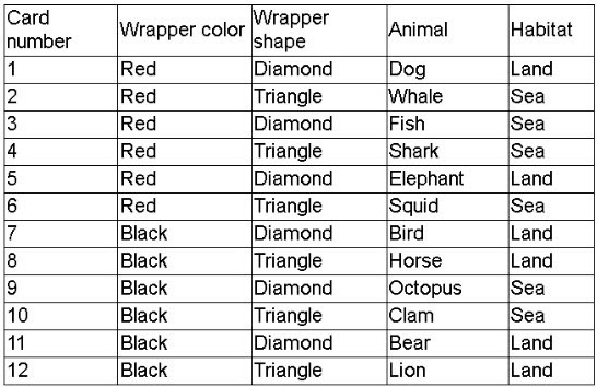 The data scientist is tasked with designing an initial model iteration to predict whether the
animal on the card lives in the sea or on land, given the card's features: Wrapper color,
Wrapper shape, and Animal.
The data scientist is tasked with designing an initial model iteration to predict whether the
animal on the card lives in the sea or on land, given the card's features: Wrapper color,
Wrapper shape, and Animal.
Which of the following is the best way to accomplish this task?
A. ARIMA
B. Linear regression
C. Association rules
D. Decision trees
Explanation:
Best Approach: Decision Trees
The problem is to predict whether an animal lives in the sea or on land using categorical features: Wrapper color, Wrapper shape, and Animal. This is a classification task, not a forecasting or continuous prediction problem. Decision trees are the best option here because they are designed for classification and regression, can easily handle categorical data, and are highly interpretable. A decision tree can split on attributes like Animal = Whale or Wrapper color = Red and directly predict the outcome (Sea or Land).
Decision trees are also advantageous because they can deal with non-linear relationships and interactions between features without requiring complex preprocessing. For an initial iteration of the model, interpretability is key, and decision trees provide a clear path of logic that can be communicated to non-technical stakeholders.
📖 Reference:
Han, J., Pei, J., & Kamber, M. (2011). Data Mining: Concepts and Techniques (3rd ed.). Morgan Kaufmann.
Scikit-learn: Decision Tree Classifier
.
Why the Other Options Are Not Correct
A. ARIMA
ARIMA (AutoRegressive Integrated Moving Average) is used for time-series forecasting. It models patterns like trends, seasonality, and autocorrelation across time. In this dataset, there is no temporal component—cards are not sequential time-based observations. Predicting Sea vs Land is a classification task, while ARIMA outputs continuous numeric forecasts. Therefore, ARIMA does not apply.
📖 Reference:
Hyndman, R. J., & Athanasopoulos, G. (2018). Forecasting: Principles and Practice. OTexts.
B. Linear Regression
Linear regression is a method used to predict a continuous dependent variable from one or more independent variables. For example, predicting a house price from square footage and location. In this case, the dependent variable (Habitat) is categorical (Sea vs Land), not continuous. While logistic regression would be appropriate for binary classification, linear regression is not correct because it assumes numeric continuous output. Applying linear regression here would yield invalid probabilities and poor performance.
📖 Reference:
James, G., Witten, D., Hastie, T., & Tibshirani, R. (2021). An Introduction to Statistical Learning with Applications in R (2nd ed.). Springer.
C. Association Rules
Association rule mining (e.g., Apriori, FP-Growth) is used to identify relationships between items in transactional data. For example, in retail: “If a customer buys bread, they are likely to buy butter.” While association rules reveal interesting patterns in co-occurrence data, they are not predictive classification models. Here, the goal is to predict a single label (Sea or Land) based on features. Association rules would not directly output a class prediction for unseen data, making them unsuitable for this task.
📖 Reference:
Agrawal, R., Imieliński, T., & Swami, A. (1993). "Mining association rules between sets of items in large databases." ACM SIGMOD Record, 22(2), 207–216.
Why Decision Trees Are Best
Handles categorical data: Attributes like wrapper color, shape, and animal type can be directly split in a tree.
Performs classification: Directly outputs a class (Sea or Land).
Interpretability: The path from root to leaf provides clear decision logic.
Initial iteration suitability: Easy to implement, visualize, and explain before moving to more complex ensemble methods (Random Forests, Gradient Boosting).
| Page 2 out of 9 Pages |